Showing posts with label finished works Friday. Show all posts

Thursday, October 20, 2011

Hope SOLD

Hope
7" x 9" watercolor
photo reference used with permission by Steve Evans (babasteve on flickr)

I belong to a small portrait group and this photo was our challenge for September. This is the first time I've painted dark skin tones and I really enjoyed it. There were some gorgeous, rich colors that I loved trying to figure out what color mixes I should use to paint them with.

I loved the model's wide, expressive eyes and the shape of her lips. (Which was unusual for me as I find lips one of the hardest parts of a portrait. What was that John Singer Sargent said. . . there's something a little bit wrong with the mouth? Yeah, lips are tricky.)

And I think fall has finally come to Utah! Huzzah!! The weather is perfect and the mountains are almost completely red from all the leaves turning on the trees. I drove near the mountains yesterday and had to remind myself to keep my eyes on the road because all I wanted to do was stare at the gorgeous color all around me.

Pretty, yes?

In other words, I am feeling super inspired lately and can't wait to try out some new painting ideas I have. Huzzah!!

*sigh* Now I think I'll go have some apple cider. After my hour-long, torturous P 90X workout that is. Huzzah???

Have a great weekend everyone. :)))

Thursday, January 13, 2011

Long Lashes and Soft Cheeks, and one year blogoversary


Long Lashes and Soft Cheeks
6" x 8" acrylic on canvas

This is my second acrylic portrait (if you're not counting the two or three disasters that I scraped off on my first try, which I am not) and it went much better than the first. I felt like I had a better understanding of how acrylics worked and also I was able to mix colors that are close to what I use with my watercolor portraits, which for some reason seemed impossible with my first one (which explains the monochromaticness of Emerge).  My favorite part are his lips, they were so fun.

And. . . . tomorrow is my one year blogoversary!

Huzzah!

I never imagined all of the benefits that would come into my life from starting this blog. I've found motivation to paint more often, I think I've really figured out a lot of things about why I paint and how I like to paint and what it means to me in my life right now. And probably most importantly, I've made friends and found support from so many amazing people that I never would have even known existed without starting this blog.

It's been a crazy fun ride, that's for sure.

Thank you so, so much to all of you for following along with me. I hope you feel welcome and appreciated here, because my good friends, you truly are. :)

I thought I'd leave you with my first ever blog post, just for kicks. (And talk about a wierd coincidence that this piece is SO similar to the piece I've posted today.)


January 14, 2010
Beautiful to Me
20" x 24" pastel on toned paper

Hello, I'm Crystal Cook welcome to my blog! I'm a full time mother of three and part time artist, whenever I can fit it in. I specialize in portraits of children in watercolor, but also use pastel, charcoal and colored pencil. I just finished this pastel in black and white and was pretty pleased with how it turned out. I was very drawn to the child's concentrated expression along with those full cheeks and lashes. But the thing that inspired me the most was the strong back light that framed that sweet face and caught the soft hair that only babies have. This was a fun piece to do, usually I work in watercolor which requires me to plan more in advance and usually takes me a while to finish. But this time I just sketched it out fairly quickly and tried to be as expressive as I could with my marks while still capturing a likeness. I think I need to break out the pastels more often it helped me get out of a rut I was in and inspired more creativity in me. Who knew a few little sticks of powdered pigment could bring such a change in my perspective?


Note to self: I've learned so many things since January 14, 2010. Including that it pays to break up your text a little bit. Paragraphs are your friends. Oh, oh and maybe think about titling your blog posts Crystal. Just an idea.

Have a great day everyone!


Wednesday, November 10, 2010

Left Behind


"Left Behind"
5 x 7 watercolor


I'm the youngest in my family and I seriously hero worshipped my older sister. Wherever she went, I wanted to go too. I felt like I deserved to go, I mean why wouldn't she want her cute and never annoying little sister around her ALL. THE. TIME?

I still don't get it.

She was pretty good about letting me come with her almost all the time. Except for those times when she had dates or dances. Then I had to stay home. :( Come on, you didn't want your little sister to go on your dates with you either?  That's just shocking.

I imagine I looked a little like this horse when I had to stay home. Except for a fence, it would have been my face pressed to the window.

I watched this horse get left behind for some reason (maybe she was sick, or not strong enough to go on long mountain treks with the others) all summer long. And every time she would wait at the fence, leaning into it and craning her neck to try and get a glimpse of her friends.

It was really touching to see her devotion and it reaffirmed to me that in some ways we're not all that different from animals. We all just want to be with the people (or in this case, horses) we love.

On a little bit lighter note, a few days ago I heard from a blog reader, Jake, who thought he had a better idea for the title of a recent piece I posted.

I'm always open to suggestions and honestly, I kind of titled this painting in a moment of desperation. I was in an EXTREME hurry and called it the first thing that came to mind.

But I think I like Jake's title better. So, I'm rechristening "Radiance" to. . .


"A Rather Blustery Day"

Thanks for the great title Jake!

I'll see you guys later, have a great next couple of days!


Friday, November 5, 2010

Radiance


'Radiance'
pastel on toned paper 11 x 14

I did this piece today just for you. So I hope you like it. :)

I had nothing to post since I'm working on two large paintings that have a lot of detail and they are taking me FOR-E-VER. And I'm still trying to get the colored pencil piece from this post finished and it's slow going too.

But it's good. I don't mean to say that slow is bad. It's therapeutic and meditative and all that. Except for impatient people like me. I have to tell myself every time I put brush to paper "DON'T rush this!" 

That has been one of the most important things for me to learn with the way I like to paint. I don't have to paint fast. There's no hurry. I like to have glowing color and accurate facial features. And for me to do that I have to take my time. It's fine. I've come to grips with this reality. Mostly. :)

I had a few questions from the previous post that I did not get to answer (life is hectic! But what else is new?) I read all of your comments and they really mean a lot to me. Thanks for taking the time to tell me what you think! You guys rock in an all out glorious way.

These are the questions that I can remember. If I forgot yours ask me again okay? I'm having a blonde day.

Where've you been? Here! I promise. Just busy. I'm glad you guys missed me though. And I mean that in a good way. Also in addition to my painting, mommy, wife, and church jobs I've decided to do NaNoWriMo.

What the heck is NaNoWriMo you ask? It's National Novel Writing Month. The idea is you write an entire novel, start to finish, 50,000 words (which ends up being a book about the size of 'The Great Gatsby') in 30 days.

Yes, I agree with you.

I am crazy.

But, it's a lot of fun and I'm totally in love with my story so far. There's a little widget on the side of my blog that shows my progress to the 50,000 word deadline. You can cheer me on if you want! I love cheerleaders!

Do you prefer bristol to regular cartridge paper? Yes, I do. Most of the time. Bristol is very smooth and is great for drawings with lots of detail. I really love it for colored pencil pieces. But it's not so great for work where you want texture and lots of nice line work. At least in my opinion. So when I use charcoal or pastel I don't use bristol. I like a paper that has some tooth or a really great sanded surface.

And, last but not least, tonight is the opening reception for the Carriage House Gallery Holiday Invitational Exhibit. It runs from tonight until December 30. And there are two artist receptions. One is tonight from 6 - 9 and the other one is December 3 from 6 - 9.

If you feel like taking in some art in Ogden stop by and see me! It'll be fun.

Have a great weekend everyone!

Friday, October 22, 2010

Resplendent


"Resplendent"
5 x 7 watercolor


      Yesterday I wanted to paint something that I could start and finish in one day, something that would have lots of color and light, and something that would be fun. A no stress painting.

      I think that a rose fit that description perfectly. I really enjoyed painting this, it was FUN. I liked that I was able to concentrate more on the abstract shapes of the flower, that I could let the paint flow and mingle a little more than I usually do and that I got to use all that pink! My favorite! :)

     And I'm really having fun with this smaller size. I'm thinking of giving this painting a day thing a try, at least a few times a week. You'll probably be seeing more of them from me. :) 

     I used this beautiful, warm pink color on this rose, but it had been on my palette for so long that I've forgotten what color it is! I now have to go through my tubes of paint and try and match it. D-oh! It's not one of the more common pink hues like permanent rose or rose madder, I think it was a Quinacridone color. At least I've narrowed it down a little right? And, I seriously LOVE those quinacridone colors. SO pretty.

      Have a great weekend everyone!

Friday, October 1, 2010

Jack and the Skeleton


"Jack and the Skeleton"
10 x 14 watercolor

     Well, it's finished! And on the first of October, very spooky connection don't you think? This was a really fun painting. I loved painting the bones on his costume, all that reflected light, it's one of my favorite things to paint.

     Did you know that October is National Art Month? Neither did I, but I think it's a very cool thing. I have another art exhibit opening tonight in Ogden, Utah at the Gallery at Ogden Blue Print. It's a statewide juried show in honor of National Art Month. It should be fun, I'll let you know how it goes. And maybe, if I'm having a good hair day, I'll take some pictures. :)

     And the contest is now officially over, all I have to do is tally up the entries and stick them in random.org to choose a winner. I thought that would be the fairest way to do it, but if you earned any extra entries you'll have a greater chance to win. Good luck to you all! I hope to have it all finished this weekend so I can announce the winner on Monday. So, be sure to check back then.

     Have a great weekend everyone!

What I'm listening too: Waiting For The End, by Linkin Park 


Friday, September 17, 2010

Target


"Target"
5 x 7 watercolor


     This was a fun piece to do, and it was pretty quick too. Which is always great for me because I think I'm one of the top five most impatient people on the planet. I was always the kid who asked if we could open Christmas presents a day early.

      I just love that face. There's something about mountain lions that I think is such a perfect combination of fierce and beautiful. I love how the light makes her fur look so soft. It makes me want to bury my hands in it, if doing so would not endanger my life and limbs. ;)

Target


"Target"
5 x 7 watercolor

      This was a fun piece to do, and it was pretty quick too. Which is always great for me because I think I'm one of the top five most impatient people on the planet. I was always the kid who asked if we could open Christmas presents a day early.

       I just love that face. There's something about mountain lions that I think is such a perfect combination of fierce and beautiful. I love how the light makes her fur look so soft. It makes me want to bury my hands in it, if doing so would not endanger my life and limbs. ;)

Friday, September 10, 2010

Brand New


"Brand New"

10 x 14 watercolor

"Making the decision to have a child is momentous. It is to decide forever to have your heart go walking around outside your body."  -  Elizabeth Stone

      I have decided that I really like this painting. It's one of my favorites. Mostly because when I look at it I can remember so clearly what it felt like to hold my brand new baby, how he smelled like everything sweet and hopeful, how he gripped my finger with such force that I was sure he'd never let go.

      But what I remember most is how it felt like he had filled a hole in my heart that I'd never even known was there.

Friday, September 3, 2010

Cadence


"Cadence"
8 x 8 watercolor

     I decided to crop out a couple of inches on the side. I think I like it better with the emphasis just on the horse and his mane. The mane is really what I found the most interesting, how it looked so full of movement. And the way the horse looks posied in the middle of his stride, I love that. For some reason, whenever I hear the word cadence I always think of horses running. It reminds me of being a kid and spending hours wandering around the pasture with the horses. Good memories :)

    Oh, and tonight's the opening reception for a local art show that I'm participating in. It's at the Gallery at Ogden Blue Print. If you're local (to Utah) stop by and see me!

Friday, August 27, 2010

Eyes So Blue


"Eyes So Blue"

10 x 14 watercolor


"Where did you come from baby dear?
Out of the everywhere, into the here.
Where did you get your eyes so blue?
Out of the sky when I came through.
What makes your forehead so smooth and high?
A soft hand stroked it as I went by.
What makes your cheek like a warm, white rose?
Something better than anyone knows.
Where did you get that pearly ear?
God spoke, and it came out to hear.
How did they all just come to be you?
God thought about me and so I grew.
But how did you come to us Baby Dear?
God thought of you, and so I am here."
 -George MacDonald

 
A painting of my baby, when he was just a baby. This one is very dear to my heart.

Tuesday, August 17, 2010

Beautiful Girl


"Beautiful Girl"
original watercolor 10 x 14

     I took a little more time with this painting. I could see that it was headed in the direction I wanted to go and I didn't want to rush it and make a mistake. I'm happy with it, I think it captured what I was trying to express.

     My niece is at the age where she's in between, not quite adult, but not a child either and I wanted to try and capture some of that transition here.

     I was captivated by her fresh, glowing skin tones, the pattern of shadows across her face, and the way the sun lit up her hair. I also really  loved her expression. She knew I was trying to get a picture of her and I caught her just as she glanced over at me, before she had time to pose or hide her face, but she's obviously humoring me. I think you can see a little of that in her eyes. She's such a beautiful girl, inside and out. :)

      I've fallen behind on my schedule of blog posts, this week is going to be a little different. Sketchbook Tuesday is going to be on Thursday, but everything else should stay the same. I'm starting a new painting today for my WIP post tomorrow. It's always so exciting to start something new, don't you think?

     And one last thing before I go. Our fellow blogger and talented photographer, Rachel Roushy, is having a contest to celebrate her 100th photo of the day post. You can win one of her photos, how awesome is that?! You can find her blog here: http://www.rachelsopenawindow.blogspot.com/

Monday, August 9, 2010

Become


"What he may become"
watercolor 10 x 14

     "When I approach a child, he inspires in me two sentiments: tenderness for what he is, and respect for what he may become."
Louis Pasteur

    I'm combining Friday finished works with motivational Monday, because, um. . .  I didn't get this done until Saturday :) Sooooo, I'm gonna be quiet for once this Monday and just send you to the best motivational post for all creative type people I've ever read. And it just so happens to be written by one of my all time favorite authors.

     Now, if you don't mind my good friends, go check it out right here, and consider your creative butt kicked. :)

Friday, July 23, 2010

Finished works Friday, and photo tips for your artwork


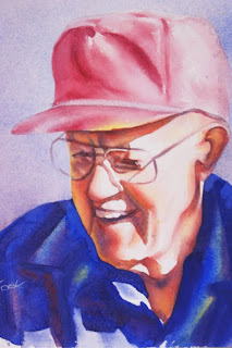
Miss You Grandpa

watercolor 8 x 10

     When my husband and I had been dating for a few weeks he took me to see his grandparents. Almost instantly they loved me as one of their own grandkids. Once we were married and my husband was going to school, and we were beyond poor, they let us live in their basement apartment. It was one of the happiest times in my life because I got to spend so much time with them, and my son (we just had one at the time) got to grow up knowing and loving them too.

     They became my grandparents.Then three years ago my grandpa died, he was one of the best men I have ever known and I still miss him so much. I painted this quick portrait of him the day after his funeral. I had to do something with the emotions that wanted to drag me down to despair, so I painted this image of him, it's how I remember him.

     Miss you Grandpa, I love you.


Photo tips for your artwork

     These tips are things I have found useful, I am not a photographer. I have very basic photography skills and am in no way trying to sound like an expert. These are just some things that work for me and I'm sharing them with you because I thought they might help you too.

     First: the number one thing I try to do is to take a picture that accurately represents my artwork. And so I might try a couple of different things to get the image I'm looking for. Like lighting or camera settings.

     Second: I use a digital SLR camera. I've tried once to use a point and shoot when I first started, but it just didn't work. If possible always try to use a DSLR camera when taking your photos. Of course a film SLR is just as good, but since most art competitions require you to enter digitally it's just a whole lot easier to use a DSLR.

     Third: I always use daylight, and I almost never use artificial lighting. What I like to do is take my photos before noon in  my kitchen where I have a big glass door that leads to the backyard. Lots of nice light comes in right there (incidentally this is also where I take any photos of models or still lifes, you need to find a spot that has the kind of light you feel comfortable working with. Indirect sunlight is what I think works best for photographing your work.) 

     Fourth: Always, and I mean always photograph ONLY your artwork. Don't include the frame or mat or let any gaps show if you can help it. This is for competition guidelines and also for work in your portfolio or website, it looks more professional. And I know of at least one artist who had a very beautiful piece that did not get accepted to a prestigious competition because they photographed the mat too.

     Okay, so now I'm going to contradict myself, if you want to show the mat and frame in your photo, maybe an art buyer wants to see the frame, or maybe you want to show what it looks like all finished up (Sandra did this a few weeks ago, and it worked really well), then by all means do so. But not for competitions or your website.

     Fifth: Always turn your flash off. It's harsh and washes out your colors, and it does not look pretty :)

     Sixth: The exposure compensation button is your friend :) This button is on all DSLR cameras,it looks like a plus and minus sign (look it up in your camera manual, I had to do that :). Just by adjusting this control up or down even a little bit, can make a HUGE difference in how your photo looks. I use this button when the light is low, or even when it's very bright. I love it, it's my new best friend on my camera.

     Seventh: I make sure my painting is straight and flush to the wall, and then I hold my camera at the same angle to minimize distortion.

     Eighth: I take lots of shots of the same painting, sometimes adjusting the exp comp button, sometimes drawing the curtains or opening more up to get the right light, and then I go through them and pick the one that I think matches the artwork the best.

     Well, that's what I do :) Hope it was helpful. Have a great weekend guys!

Friday, July 16, 2010

Roses on My Table


"I'd rather have roses on my table than diamonds on my neck."
Emma Goldman


"By Any Other Name"

watercolor 10 x 14

      I painted this rose from my mom's garden as a gift for someone last year. I gotta say that using all those bright colors and painting more wet in wet than I usually do was very exciting. I'd forgotten about that. Must try to remember it now :)

      Ahhh, roses. They just say love and summer don't they?


Related Posts with Thumbnails